
CASE STUDY
Vespertine: Ah, Paris!
01
What I designed
Vespertine is a travel app I’m designing for people who would rather wander than follow an itinerary. Its central idea is that a good suggestion depends on the moment: how you feel, how much time you have, where you are and what’s open right now.
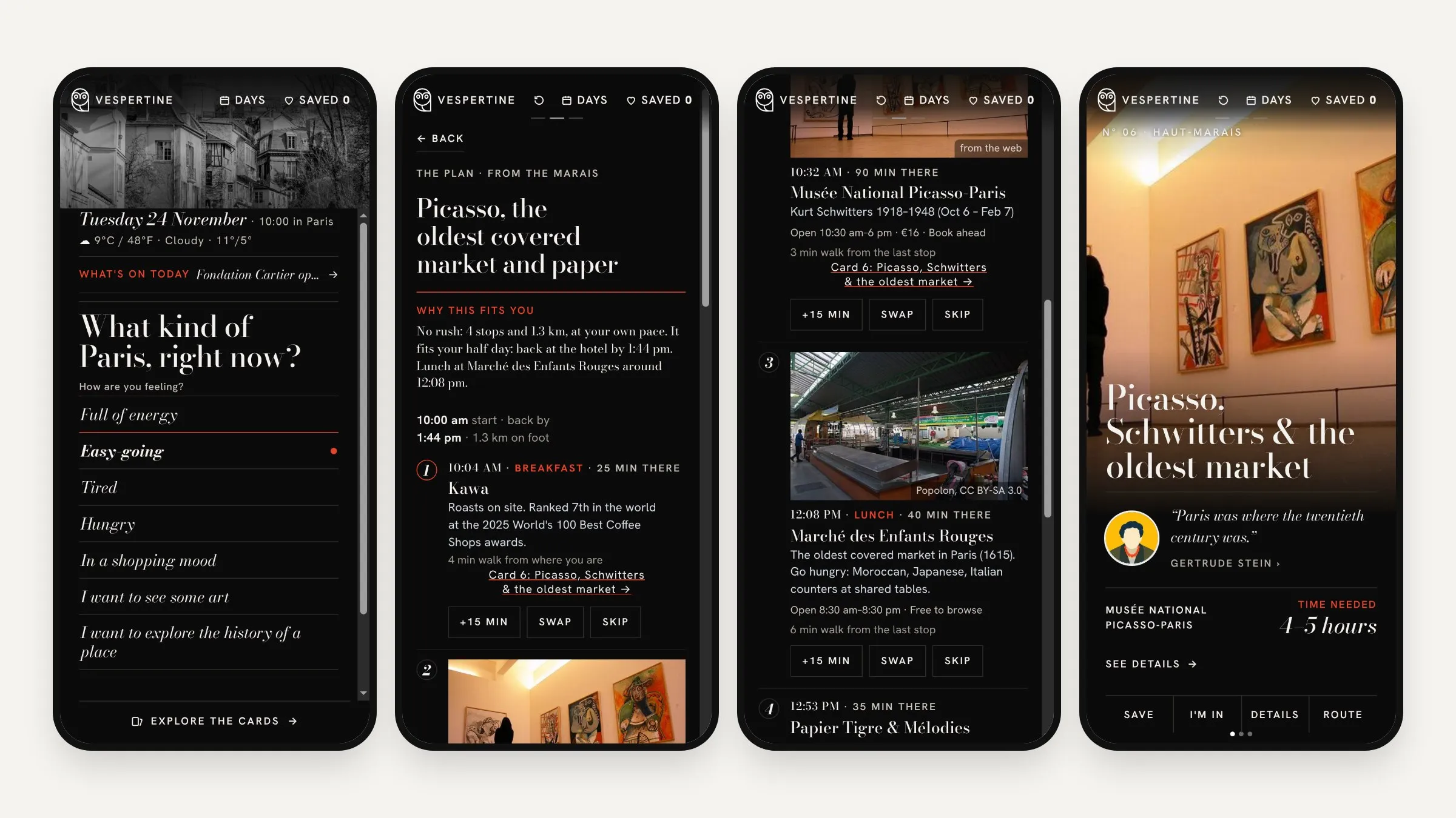
I’m testing it on a real week in Paris this November with family. The prototype is a vertical feed: fifteen planned days, each built around one museum or show, plus cards made for right now, with stops that are open, a time for each, a walking route and a way home.
02
What I explored
I designed it with Claude as my design partner, then refined the designs in Figma. Along the way we shifted to a second sketch, Paris Field Map, to test the same idea as a map with a concierge.
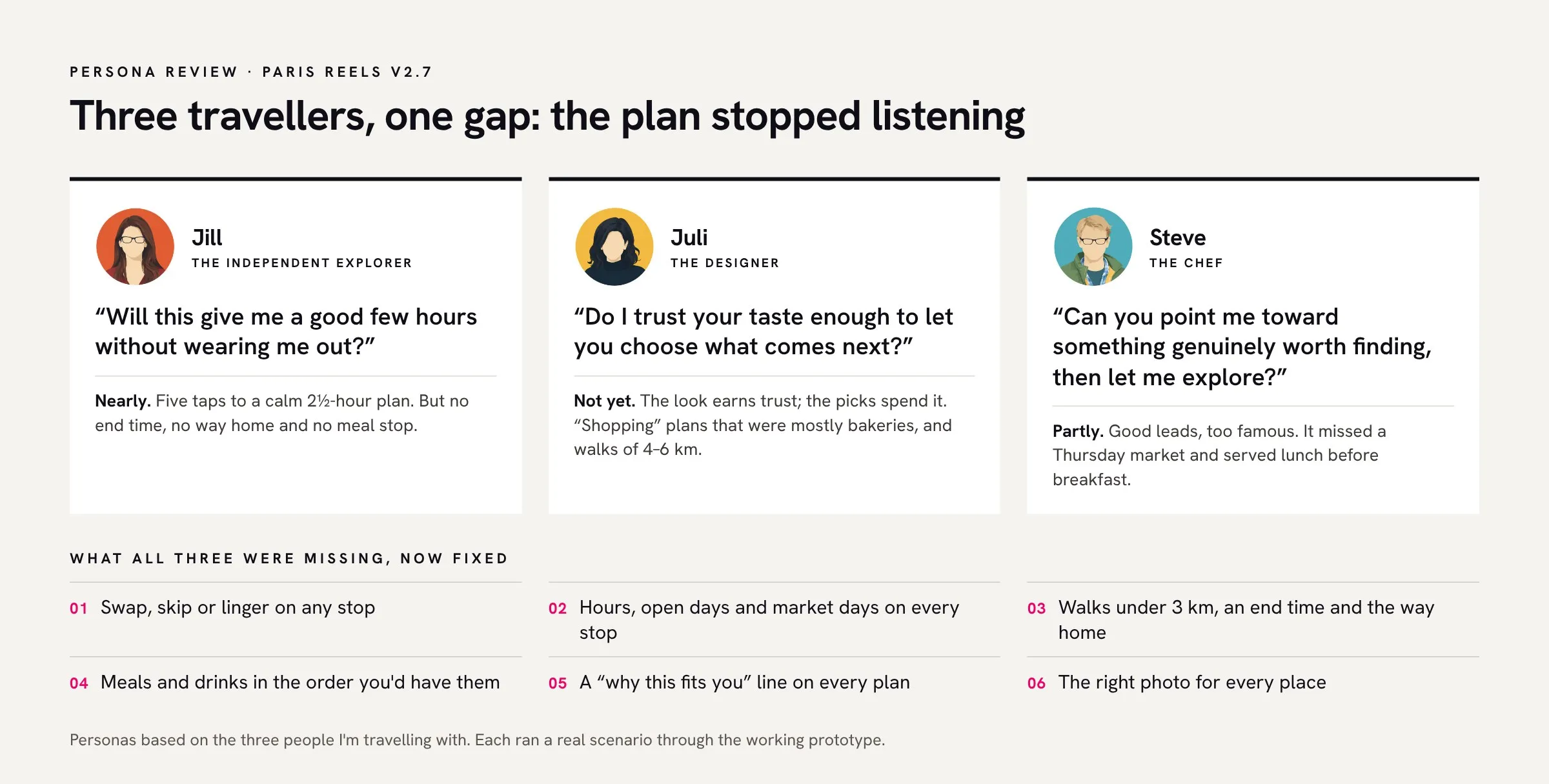
Then I wrote personas for the three people I’m travelling with, Jill, Juli and Steve, and ran each through the working prototype with a real scenario. All three hit the same gap: once a plan appeared, it stopped listening. That led to six fixes: swap, skip or linger on any stop; opening hours and market days; walks under 3 km with an end time and a way home; meals in the order you’d have them; a line on why each plan fits you; and the right photo for every place.
03
What I prototyped
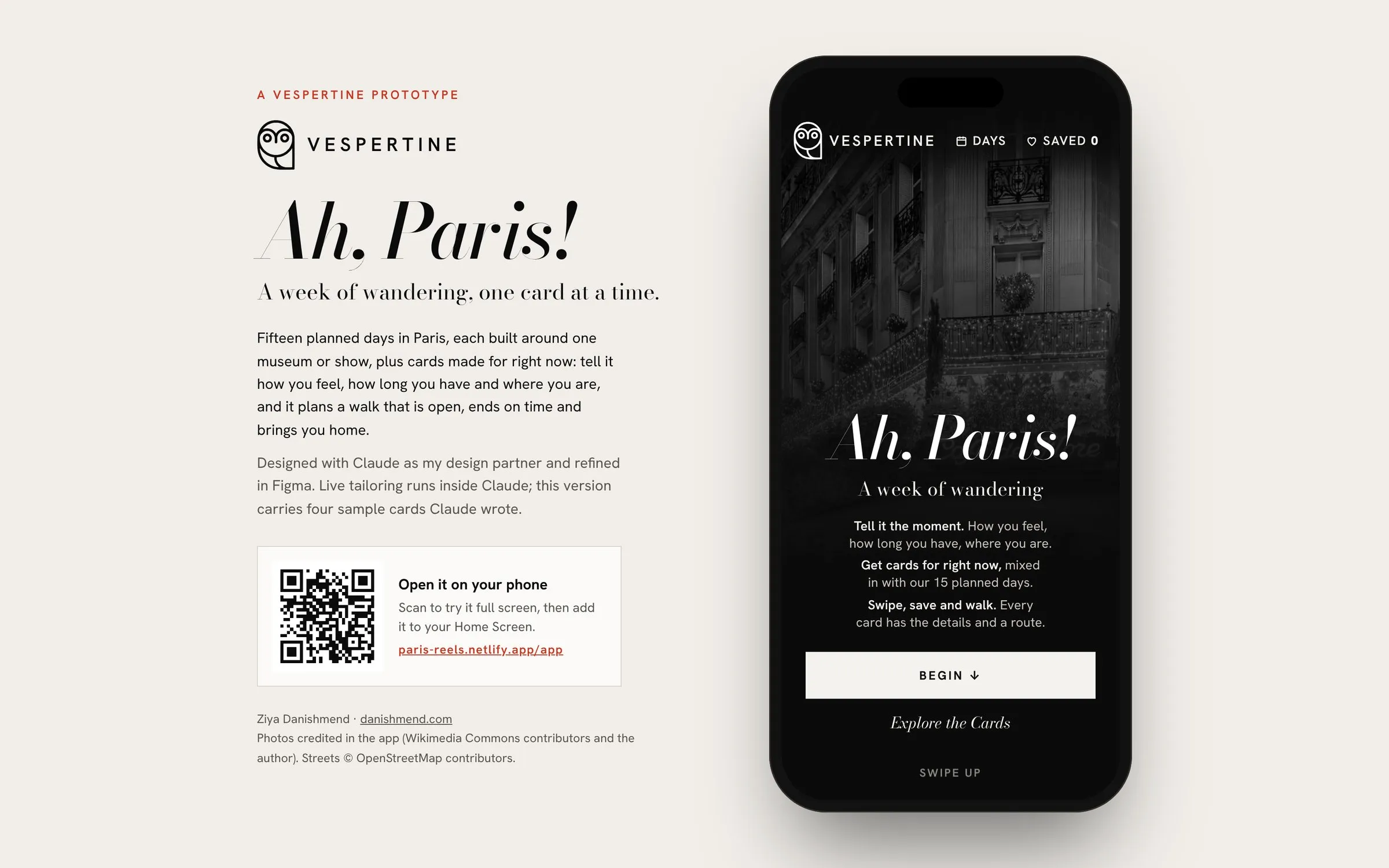
The prototype runs as a phone app. On a computer it opens inside an iPhone frame with a QR code. On a phone you can add it to your Home Screen, and it opens full screen with its own icon. Try it here on Netlify.
Live tailoring only works inside Claude, so this version carries four sample cards Claude wrote for different moods: a slow lunch at the Odéon, the Marais one bite at a time, Zurbarán and the new Fondation Cartier, and Julia Child’s Left Bank. The version I’m using for the trip is still in progress.
Photos credited in the app (Wikimedia Commons contributors and the author). Streets © OpenStreetMap contributors.
See it move
A 28-second walk through the prototype: the opening card, three quick questions, a plan made for an easy-going morning in the Marais drawn along its real walking route, and the Picasso day card it leads to.
04
Finding a look
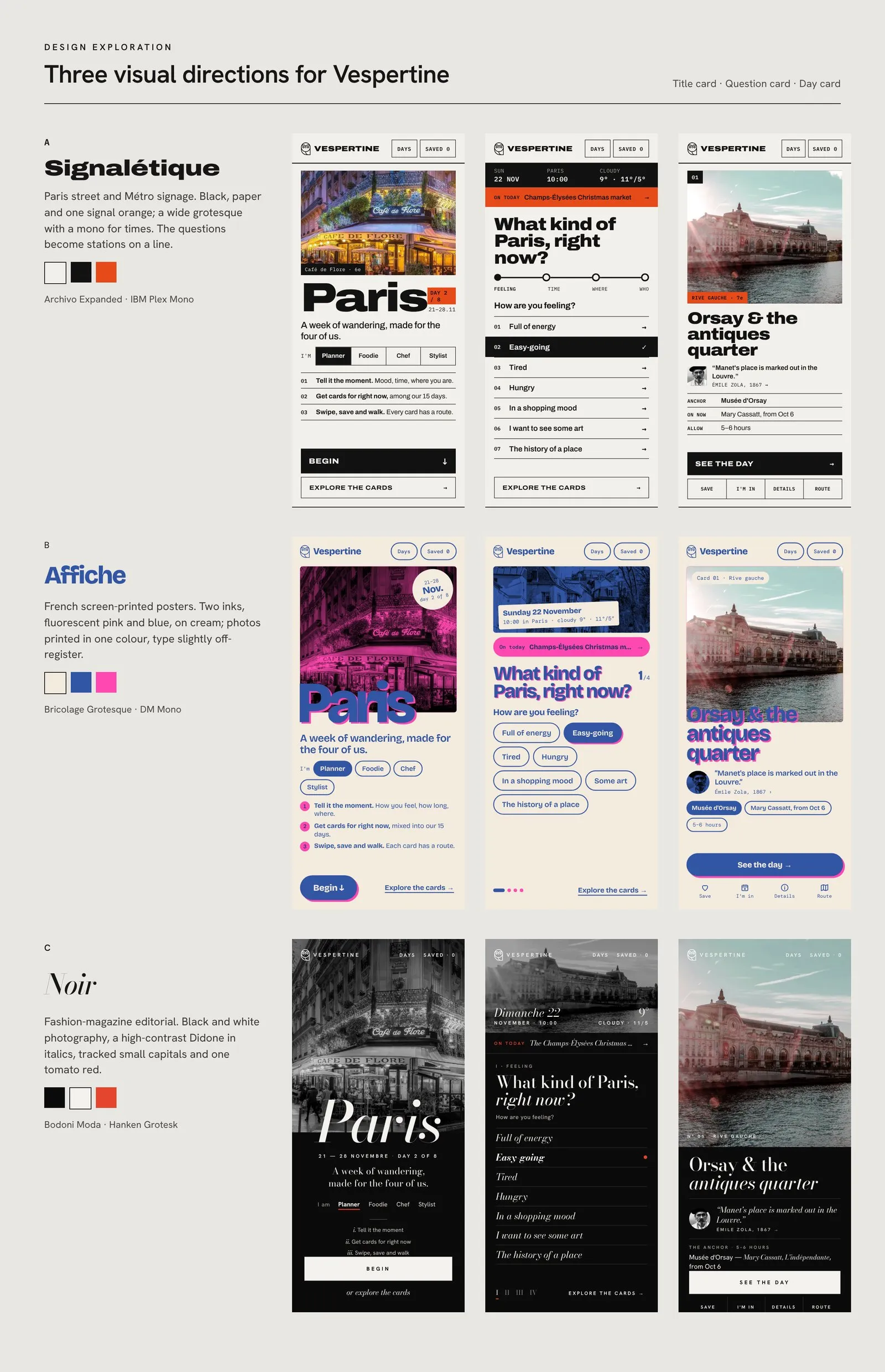
The first version leaned on a serif, brass and navy palette that felt a little too familiar, a touch of “designed with AI”. So Claude and I explored three visual directions, each tried on the title card, the question card and a day card:
Signalétique, after Paris street and Métro signs.
Affiche, after French screen-printed posters.
Noir, after fashion magazines.
I chose Noir, and it now runs through the whole prototype: black and white photography on the opening screens, colour on the day cards, a high-contrast serif in italics and one red accent. See the full board.